Gap:
Construction
Site
HAL Gap Release Note
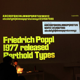
The journey of HAL Gap began with the discovery of a forgotten piece of type design. Digging the crates of past typography, I stumbled upon Poppl-Leporello by Friedrich Poppl, released in 1977 by Berthold. Poppl (1923–1982) was a German type designer, calligrapher and teacher. Apart from his unpublished 1960 Dynamische Antiqua, all of his fonts were distributed by Berthold/Linotype ❶ and titled with the prefix “Poppl”.

Poppl-Leporello by Friedrich Poppl
Visiting numerous genres throughout his career, such as script, blackletter, serif, handwriting, etc., Leporello stands out conceptionally. Its design is both visually striking and original, leaving me even more puzzled why the face was discontinued (and is digitally unavailable today). Due to its name, one can only assume Poppl was inspired by a leporello (folded leaflet) to crop and trim the round elements, resulting in vertically straight edges on both sides. This leads to unusual letterforms and allows for tight spacing, making it a perfect headline font. Poppl created one style, bold and upright, and its public remains are reduced to A–Z, a–z and 0–9.
Width and weight
After an initial and exploratory revival, which I created as part of my MA grad project on “lost type” ❷ at UdK Berlin in 2020, Studio HanLi started testing Leporello’s vibe in some design work. Poppl’s concept was convincing and sparked the question: what happens if we continue to carve the round characters? How much can be removed until the shapes break? This notion automatically renders a range of styles diverging simultaneously in both width and weight. Hence, the idea for Gap was born. Leporello’s original weight sits close to Gap M, so adding more weight seemed just as logical as trimming it. With Gap M in the middle, there are three more styles in both directions, making a total of seven: XXS, XS, S, M, L, XL, XXL.
Room 210, UdK Berlin, 2020
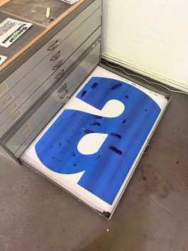
An “a” screen printed on A0
Gap falls into a special group of more recent typefaces, which are technical renditions of historic designs. The approach blends an interesting idea from the past with the digital possibilities of today’s type design. Other examples that come to mind are Dinamo’s ABC Grow (designed by Johannes Breyer and Fabian Harb and influenced by Les Lawrence’s Stack, 1969), Lineto’s LL Cobra VIP (originally designed by Cornel Windlin and revised by Samara Keller, inspired by Ad Werner’s Dubbeldik, 1972), and our very own HAL Twins (an extension of Franco Grignani’s Gemini Computer, ca. 1966). For the fonts listed above, the stylistic inspiration gave way for an execution that would only be possible decades later. These original designs were simply ahead of their time, all created just a few years apart in the dawn of the digital age. It’s a magical symbiosis of style and technology: a cool idea meets its full potential in the following century, a time-travelling sweet spot. Picture Rotis, if Otl Aicher had used Glyphs. Today’s typefaces will hopefully inspire type designers in 2075 to revisit and refresh them for their specific environments.
Slicing the letters
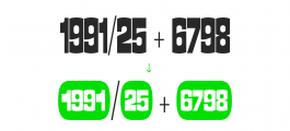
Back to Gap: the family’s range emerged rather naturally. When cropping the round elements, slice by slice, they obviously get thinner and more condensed. When adding to the the round elements, bit by bit, the characters become thicker and automatically wider. The other, not-round characters then followed suit in terms of weight and width. Therefore, XXS is extremely thin and condensed, while XXL is severely wide and extended. Gap feels very comfortable in headline situations. But it won’t shy away from also working with sentences, paragraphs and longer texts. Be aware, setting it in smaller text sizes, requires more spacing to be added. Gap was published with purposeful tight spacing, ideal for display situations in larger sizes.
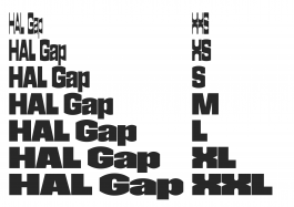
Seven predefined static styles + infinite inbetween-styles (variable font)
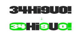
In terms of aesthetics, Poppl’s concept grants the typeface a very sharp and compact appearance. The trimmed characters result in unique shapes and as a whole produce a sturdy rhythm. The look is quite graphic and visually compelling and could also be characterised as boldly solid. From S to XXL: their weights increase along the spectrum expected of a sans family. However, the reverse-contrast XXS and XS add playful and unusual flavours to the group. Additionally, there are plenty of interesting opentype features, to make typesetting with Gap even more fun.

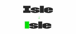

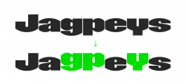

Alternate lowercase l, i, j and 1 (ss01)
Alternate uppercase I (ss02)
Alternate lowercase t (ss03)
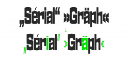
Alternate punctuation (ss05)
Baseline descenders (ss13)
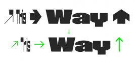
Alternate arrows (ss08)
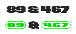
Circled numbers white (ss14)
Circled numbers black (ss14)
Alternate circled numbers black (ss16)
Alternate “cool S” (ss20)
To top it off, Gap’s functional variable font ranges the extremes of XXS to XXL. It’s not only useful for motion designers and typographers working on reels and videos with animated type. Print designers will also profit from Gap’s flexibility. It’s very easy to adjust Gap and make it fit perfectly in any layout. Solve any dimensional constraints by simply working with the variable font and optimising the width of any headline point by point. Also, cleaning up the ragged line endings of paragraphs (by modifying the line lengths) is effortless with Gap variable. And finally, it performs extremely well when using the HAL TypePad ❸ for experimental static typesetting. One last thing, Gap caters to 385 languages ❹ (3.1 billion speakers), so we’ve got you covered to fill the gaps.
Thanks for reading,
Lucas from HAL Typefaces ❺

DIN-format tall

DIN-format wide (variable font → easy fit)
Footnotes
(1) Friedrich Poppl’s entry in the digital archive of the Klingspor Museum, Offenbach am Main
(2) Research, Revivals & Renditions. MA grad project, University of the Arts Berlin, 2020
(3) Check it out: TypePad Part 1: Origins and TypePad Part 2: Manual
(4) Read more on Christoph Koeberlin’s Latin-S characterset
(5) This text was set in HAL Magic Mid Regular
Gap:
Construction
Site
HAL Gap Release Note
The journey of HAL Gap began with the discovery of a forgotten piece of type design. Digging the crates of past typography, I stumbled upon Poppl-Leporello by Friedrich Poppl, released in 1977 by Berthold. Poppl (1923–1982) was a German type designer, calligrapher and teacher. Apart from his unpublished 1960 Dynamische Antiqua, all of his fonts were distributed by Berthold/Linotype ❶ and titled with the prefix “Poppl”.
Poppl-Leporello by Friedrich Poppl
Visiting numerous genres throughout his career, such as script, blackletter, serif, handwriting, etc., Leporello stands out conceptionally. Its design is both visually striking and original, leaving me even more puzzled why the face was discontinued (and is digitally unavailable today). Due to its name, one can only assume Poppl was inspired by a leporello (folded leaflet) to crop and trim the round elements, resulting in vertically straight edges on both sides. This leads to unusual letterforms and allows for tight spacing, making it a perfect headline font. Poppl created one style, bold and upright, and its public remains are reduced to A–Z, a–z and 0–9.
Width and weight
After an initial and exploratory revival, which I created as part of my MA grad project on “lost type” ❷ at UdK Berlin in 2020, Studio HanLi started testing Leporello’s vibe in some design work. Poppl’s concept was convincing and sparked the question: what happens if we continue to carve the round characters? How much can be removed until the shapes break? This notion automatically renders a range of styles diverging simultaneously in both width and weight. Hence, the idea for Gap was born. Leporello’s original weight sits close to Gap M, so adding more weight seemed just as logical as trimming it. With Gap M in the middle, there are three more styles in both directions, making a total of seven: XXS, XS, S, M, L, XL, XXL.
Room 210, UdK Berlin, 2020
An “a” screen printed on A0
Gap falls into a special group of more recent typefaces, which are technical renditions of historic designs. The approach blends an interesting idea from the past with the digital possibilities of today’s type design. Other examples that come to mind are Dinamo’s ABC Grow (designed by Johannes Breyer and Fabian Harb and influenced by Les Lawrence’s Stack, 1969), Lineto’s LL Cobra VIP (originally designed by Cornel Windlin and revised by Samara Keller, inspired by Ad Werner’s Dubbeldik, 1972), and our very own HAL Twins (an extension of Franco Grignani’s Gemini Computer, ca. 1966). For the fonts listed above, the stylistic inspiration gave way for an execution that would only be possible decades later. These original designs were simply ahead of their time, all created just a few years apart in the dawn of the digital age. It’s a magical symbiosis of style and technology: a cool idea meets its full potential in the following century, a time-travelling sweet spot. Picture Rotis, if Otl Aicher had used Glyphs. Today’s typefaces will hopefully inspire type designers in 2075 to revisit and refresh them for their specific environments.
Slicing the letters
Back to Gap: the family’s range emerged rather naturally. When cropping the round elements, slice by slice, they obviously get thinner and more condensed. When adding to the the round elements, bit by bit, the characters become thicker and automatically wider. The other, not-round characters then followed suit in terms of weight and width. Therefore, XXS is extremely thin and condensed, while XXL is severely wide and extended. Gap feels very comfortable in headline situations. But it won’t shy away from also working with sentences, paragraphs and longer texts. Be aware, setting it in smaller text sizes, requires more spacing to be added. Gap was published with purposeful tight spacing, ideal for display situations in larger sizes.
Seven predefined static styles + infinite inbetween-styles (variable font)
In terms of aesthetics, Poppl’s concept grants the typeface a very sharp and compact appearance. The trimmed characters result in unique shapes and as a whole produce a sturdy rhythm. The look is quite graphic and visually compelling and could also be characterised as boldly solid. From S to XXL: their weights increase along the spectrum expected of a sans family. However, the reverse-contrast XXS and XS add playful and unusual flavours to the group. Additionally, there are plenty of interesting opentype features, to make typesetting with Gap even more fun.
Alternate lowercase l, i, j and 1 (ss01)
Alternate uppercase I (ss02)
Alternate lowercase t (ss03)
Alternate punctuation (ss05)
Baseline descenders (ss13)
Alternate arrows (ss08)
Circled numbers white (ss14)
Circled numbers black (ss14)
Alternate circled numbers black (ss16)
Alternate “cool S” (ss20)
To top it off, Gap’s functional variable font ranges the extremes of XXS to XXL. It’s not only useful for motion designers and typographers working on reels and videos with animated type. Print designers will also profit from Gap’s flexibility. It’s very easy to adjust Gap and make it fit perfectly in any layout. Solve any dimensional constraints by simply working with the variable font and optimising the width of any headline point by point. Also, cleaning up the ragged line endings of paragraphs (by modifying the line lengths) is effortless with Gap variable. And finally, it performs extremely well when using the HAL TypePad ❸ for experimental static typesetting. One last thing, Gap caters to 385 languages ❹ (3.1 billion speakers), so we’ve got you covered to fill the gaps.
Thanks for reading,
Lucas from HAL Typefaces ❺
DIN-format tall
DIN-format wide (variable font → easy fit)
Footnotes
(1) Friedrich Poppl’s entry in the digital archive of the Klingspor Museum, Offenbach am Main
(2) Research, Revivals & Renditions. MA grad project, University of the Arts Berlin, 2020
(3) Check it out: TypePad Part 1: Origins and TypePad Part 2: Manual
(4) Read more on Christoph Koeberlin’s Latin-S characterset
(5) This text was set in HAL Magic Mid Regular