
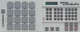
Ever wondered, why hardly anyone is using variable fonts? What’s so great about them? What exactly is a variable font? Why are they apparently so interesting? If variable fonts are dynamic, then how can they be used in static media like books, posters, etc.? If you’ve also asked yourself these questions, then you’re at the right place. Say hello to the HAL TypePad, a free tool which offers a more playful, intuitive and accessible way to work with variable fonts in Indesign. Its interface is inspired by the simplified layout of digital drum machines or MIDI controllers. The plugin has nine different buttons or operators, which can be applied to five different ranges. It allows for toggling one axis at a time or combining multiple axes. We will get into all the details a bit later. First, let’s go back and revisit the journey.

U look familiar, have we met?
In 2016, four tech giants in personal computing (Adobe, Apple, Google, Microsoft) announced their support for a new standard in their products: OpenType 1.8, featuring OpenType Font Variations. This is basically what we now call variable fonts and paved the way for a whole new way of dealing with digital type. The technology behind it, interpolation and multiple masters, was essentially not new. However, enabling users to generate any instance from a variable font on command was revolutionary. One variable font file includes an entire superfamily and an infinite number of variants can be sampled instantaneously. Typefaces ceased to only exist as numerous static font files, broken down into weights, widths, italics, etc., but could now be a completely fluid, ingenious and resourceful system, in one single file. This development sparked excitement in the tech and type community, hoping to improve the status quo of font file integration, storage and implementation across the various platforms.

Fonts are for grown ups, too
Its potential was initially observed in primarily time-based media (on the web and video) due to the ease of creating smooth and seamless transitions between the extremes of multiple axes. At the time, this was a relatively fresh look as these sort of transitory animations were certainly more difficult to render before variable font technology. After a while, it seemed like the trend had passed and animated variable fonts felt slightly gimmicky, reserved for the digital sphere, appearing mainly on websites and reels. It took Adobe until 2020 to adopt variable font accessibility into Indesign. But how could a print designer profit from working with variable fonts? Is a static medium such as printed matter even conceptually compatible with the fluidity of variable type?

U make me feel (mighty real)
In 2021, we were commissioned to design and typeset a textbook by the project’s editors Martin Karcher and Severin Sales Rödel. The book, titled Lebendige Theorie, is about the engagement with theory and philosophy and how it irreversibly alters one’s way of thinking. To translate this notion into the book’s design, we imagined the type very gradually shapeshifting from one state to another. Hence, while reading the book this transformation is subtle and hardly noticeable, yet the type on the last page is clearly different to that from the beginning. Simultaneously, this idea finally offered us a chance to cleverly work with a variable font in a print project.

We ain’t horsin’ around
At the time, Elias was putting the final touches on his ABC Arizona, the first sans to serif superfamily. The typeface was perfect for the job and we chose to typeset the book in the regular weight, starting in Serif and ending in Sans. Next, there are different ways to realising this concept. More specifically, at which frequency should the type be changing? Ideally and to take this approach to its extreme potential, the type could shift glyph by glyph, meaning we would need thousands of variants of Arizona. This was not feasible due to lack of coding and computing capabilities. The following possibilities were also not viable for the same reason: word by word, sentence by sentence, and page by page. We opted for chapter by chapter and generated roughly 30 different instances from the variable font, each one a bit more sans than the previous.

Bear with me, u’ll see
Forward to early 2024: during a talk at the design faculty of the University of Applied Sciences Konstanz, we presented Lebendige Theorie amongst other projects. Two weeks later, one of the students in the audience, Christoph Seibel, sent us a message. He had dabbled in writing scripts for Indesign and was inspired to adopt the book’s transient type concept. He sent us a script, with which one could gradually, glyph by glyph, change a text from one extreme point of an axis to the other, for example shifting a text gradually from thin to bold or condensed to extended. It sparked the idea of developing a tool for experimental typesetting with variable fonts. Indesign’s variable controls are very basic (sadly just a slider per axis) and we realised that there was potentially far more to explore in regards to static typesetting with variable fonts. We commenced a fruitful dialog with Chris and began to collaborate on developing the script further.

Coffee is my best friend
Chris, now in charge of coding and development, dove right in and quickly suggested to ditch the script and its limitations. They’re restricted to singular executions and in general more suitable for performing simple tasks. Also, the scripting language and its associated toolkit, ExtendScript, is quite old and incompatible with many more up-to-date JavaScript features. Plugins, on the other hand, are more flexible applications with improved adaptability. Another interesting feature worth mentioning: the plugin window is essentially a browser, supporting core programming languages such as HTML, CSS, and JavaScript (and therefore, also enabling the integration of web frameworks such as React, Svelte, or Vue to quickly build reactive UIs). This sounds great in theory, but considering Adobe’s adoption of browser technologies, the plugin window is not an actual browser. Hence, a developer will face all sorts of unexpected errors and inconsistencies compared to a real browser environment.

Got any loose screws?
So what’s actually possible with this set of tools? Adobe exposes all actions a user might execute as objects and functions, which a developer can use to create mini-apps with JavaScript within its plugin environment. This allows the community to add bespoke functionality to the software. In essence, the company empowers the users (on a very small scale) to construct and customise their own tools within the framework. Yet this democratisation is very limited. A plugin cannot introduce new functions, but can only operate inside the given parameters and functional capacities of Indesign. It can, however, piece together a set of commands and actions in a far more effective and efficient way, as opposed to, for instance, editing a text by selecting each letter by hand. And the plugin can only compute a set of commands as fast as the software and CPU allows. An example of this limitation is evident in longer texts with many characters: at the moment Indesign is not optimised to handle large amounts of characters with different variable styles applied to them. Because Adobe doesn’t provide functionalities to work on the source code level of Indesign, this issue can’t be solved for now. Imagine Indesign as a big machine with all kinds of gears and mechanical parts: the coding environment is like a locked control room in this machine with countless buttons, levers, switches and panels to regulate the machine.
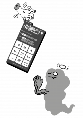
Thanks to the collaboration with Chris, we revamped the rudimentary script into a functional plugin. An intuitive and playful interface was important to us, hence we adopted drum-pad-like buttons to operate the various functions of the plugin. Chris would also like to acknowledge Bolt UXP, a command-line tool that virtually generates a simple template for the plugin, saving time with the initial setup. Without it, the production of the HAL TypePad would have been far more challenging and laborious. By the way, it’s mascot, appearing in the campaign as well as in the plugin itself, is VARIO (a foggy cloud resembled a fitting analogy to the shape-shifting appearance of variable type). VARIO is a party animal and loves gadgets, DJing, and making letters dance. Our gratitude also goes out to Dario Danielli for illustrating and animating VARIO and his antics. Please read TypePad Part 2: Manual to review its settings and functions. We hope this tool will open the door to more designers and typographers experimenting with variable fonts for print and static typesetting.
Words by HAL Typefaces
Illustrations by Dario Danielli
Plugin coding by Christoph Seibel
Footnotes
• The book Lebendige Theorie, edited by Martin Karcher and Severin Sales Rödel and designed by Studio HanLi, was published by Textem Verlag, Hamburg (ISBN 978-3-86485-256-5, 344 pages).
• We wish to acknowledge Giliane Cachin and INT studio’s Alternative Layout System, which we discovered during the development of the HAL TypePad. The plugin includes various scripts for creating unconventional text formatting, inspired by typesetting techniques from Hebrew and Arabic manuscripts, as well as a variable gradient tool.
TypePad
Part 1: Origins
Ever wondered, why hardly anyone is using variable fonts? What’s so great about them? What exactly is a variable font? Why are they apparently so interesting? If variable fonts are dynamic, then how can they be used in static media like books, posters, etc.? If you’ve also asked yourself these questions, then you’re at the right place. Say hello to the HAL TypePad, a free tool which offers a more playful, intuitive and accessible way to work with variable fonts in Indesign. Its interface is inspired by the simplified layout of digital drum machines or MIDI controllers. The plugin has nine different buttons or operators, which can be applied to five different ranges. It allows for toggling one axis at a time or combining multiple axes. We will get into all the details a bit later. First, let’s go back and revisit the journey.
U look familiar, have we met?
In 2016, four tech giants in personal computing (Adobe, Apple, Google, Microsoft) announced their support for a new standard in their products: OpenType 1.8, featuring OpenType Font Variations. This is basically what we now call variable fonts and paved the way for a whole new way of dealing with digital type. The technology behind it, interpolation and multiple masters, was essentially not new. However, enabling users to generate any instance from a variable font on command was revolutionary. One variable font file includes an entire superfamily and an infinite number of variants can be sampled instantaneously. Typefaces ceased to only exist as numerous static font files, broken down into weights, widths, italics, etc., but could now be a completely fluid, ingenious and resourceful system, in one single file. This development sparked excitement in the tech and type community, hoping to improve the status quo of font file integration, storage and implementation across the various platforms.
Fonts are for grown ups, too
Its potential was initially observed in primarily time-based media (on the web and video) due to the ease of creating smooth and seamless transitions between the extremes of multiple axes. At the time, this was a relatively fresh look as these sort of transitory animations were certainly more difficult to render before variable font technology. After a while, it seemed like the trend had passed and animated variable fonts felt slightly gimmicky, reserved for the digital sphere, appearing mainly on websites and reels. It took Adobe until 2020 to adopt variable font accessibility into Indesign. But how could a print designer profit from working with variable fonts? Is a static medium such as printed matter even conceptually compatible with the fluidity of variable type?
U make me feel (mighty real)
In 2021, we were commissioned to design and typeset a textbook by the project’s editors Martin Karcher and Severin Sales Rödel. The book, titled Lebendige Theorie, is about the engagement with theory and philosophy and how it irreversibly alters one’s way of thinking. To translate this notion into the book’s design, we imagined the type very gradually shapeshifting from one state to another. Hence, while reading the book this transformation is subtle and hardly noticeable, yet the type on the last page is clearly different to that from the beginning. Simultaneously, this idea finally offered us a chance to cleverly work with a variable font in a print project.
We ain’t horsin’ around
At the time, Elias was putting the final touches on his ABC Arizona, the first sans to serif superfamily. The typeface was perfect for the job and we chose to typeset the book in the regular weight, starting in Serif and ending in Sans. Next, there are different ways to realising this concept. More specifically, at which frequency should the type be changing? Ideally and to take this approach to its extreme potential, the type could shift glyph by glyph, meaning we would need thousands of variants of Arizona. This was not feasible due to lack of coding and computing capabilities. The following possibilities were also not viable for the same reason: word by word, sentence by sentence, and page by page. We opted for chapter by chapter and generated roughly 30 different instances from the variable font, each one a bit more sans than the previous.
Bear with me, u’ll see
Forward to early 2024: during a talk at the design faculty of the University of Applied Sciences Konstanz, we presented Lebendige Theorie amongst other projects. Two weeks later, one of the students in the audience, Christoph Seibel, sent us a message. He had dabbled in writing scripts for Indesign and was inspired to adopt the book’s transient type concept. He sent us a script, with which one could gradually, glyph by glyph, change a text from one extreme point of an axis to the other, for example shifting a text gradually from thin to bold or condensed to extended. It sparked the idea of developing a tool for experimental typesetting with variable fonts. Indesign’s variable controls are very basic (sadly just a slider per axis) and we realised that there was potentially far more to explore in regards to static typesetting with variable fonts. We commenced a fruitful dialog with Chris and began to collaborate on developing the script further.
Coffee is my best friend
Chris, now in charge of coding and development, dove right in and quickly suggested to ditch the script and its limitations. They’re restricted to singular executions and in general more suitable for performing simple tasks. Also, the scripting language and its associated toolkit, ExtendScript, is quite old and incompatible with many more up-to-date JavaScript features. Plugins, on the other hand, are more flexible applications with improved adaptability. Another interesting feature worth mentioning: the plugin window is essentially a browser, supporting core programming languages such as HTML, CSS, and JavaScript (and therefore, also enabling the integration of web frameworks such as React, Svelte, or Vue to quickly build reactive UIs). This sounds great in theory, but considering Adobe’s adoption of browser technologies, the plugin window is not an actual browser. Hence, a developer will face all sorts of unexpected errors and inconsistencies compared to a real browser environment.
Got any loose screws?
So what’s actually possible with this set of tools? Adobe exposes all actions a user might execute as objects and functions, which a developer can use to create mini-apps with JavaScript within its plugin environment. This allows the community to add bespoke functionality to the software. In essence, the company empowers the users (on a very small scale) to construct and customise their own tools within the framework. Yet this democratisation is very limited. A plugin cannot introduce new functions, but can only operate inside the given parameters and functional capacities of Indesign. It can, however, piece together a set of commands and actions in a far more effective and efficient way, as opposed to, for instance, editing a text by selecting each letter by hand. And the plugin can only compute a set of commands as fast as the software and CPU allows. An example of this limitation is evident in longer texts with many characters: at the moment Indesign is not optimised to handle large amounts of characters with different variable styles applied to them. Because Adobe doesn’t provide functionalities to work on the source code level of Indesign, this issue can’t be solved for now. Imagine Indesign as a big machine with all kinds of gears and mechanical parts: the coding environment is like a locked control room in this machine with countless buttons, levers, switches and panels to regulate the machine.
Thanks to the collaboration with Chris, we revamped the rudimentary script into a functional plugin. An intuitive and playful interface was important to us, hence we adopted drum-pad-like buttons to operate the various functions of the plugin. Chris would also like to acknowledge Bolt UXP, a command-line tool that virtually generates a simple template for the plugin, saving time with the initial setup. Without it, the production of the HAL TypePad would have been far more challenging and laborious. By the way, it’s mascot, appearing in the campaign as well as in the plugin itself, is VARIO (a foggy cloud resembled a fitting analogy to the shape-shifting appearance of variable type). VARIO is a party animal and loves gadgets, DJing, and making letters dance. Our gratitude also goes out to Dario Danielli for illustrating and animating VARIO and his antics. Please read TypePad Part 2: Manual to review its settings and functions. We hope this tool will open the door to more designers and typographers experimenting with variable fonts for print and static typesetting.
Words by HAL Typefaces
Illustrations by Dario Danielli
Plugin coding by Christoph Seibel
Footnotes
• The book Lebendige Theorie, edited by Martin Karcher and Severin Sales Rödel and designed by Studio HanLi, was published by Textem Verlag, Hamburg (ISBN 978-3-86485-256-5, 344 pages).
• We wish to acknowledge Giliane Cachin and INT studio’s Alternative Layout System, which we discovered during the development of the HAL TypePad. The plugin includes various scripts for creating unconventional text formatting, inspired by typesetting techniques from Hebrew and Arabic manuscripts, as well as a variable gradient tool.