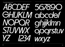
Tranquility Medium Italic
Tranquility Medium, Demi Bold, Demi Bold Italic
Tranquility Demi-Bold
HAL Magic Mid Bold
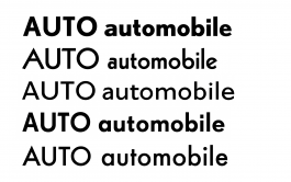
High, Mid, Low
Nobel, Kabel, Granby, Super-Grotesk, Futura
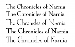
Bernhard Modern, Egmont, Koch Antiqua, Nicolas Cochin, LMR Dunhill
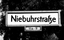
West-Berlin street sign
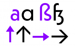
Alternates for a, ß and arrows
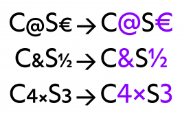
Case-sensitive settings
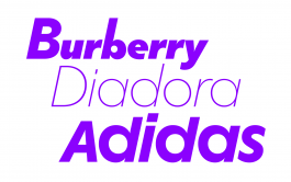
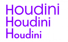
Magical branding
Tranquility Medium Italic
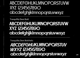
Tranquility Medium, Demi Bold, Demi Bold Italic
Tranquility Demi-Bold
HAL Magic Mid Bold
Nobel, Kabel, Granby, Super-Grotesk, Futura
Bernhard Modern, Egmont, Koch Antiqua, Nicolas Cochin, LMR Dunhill
High, Mid, Low
West-Berlin street sign
Alternates for a, ß and arrows
Case-sensitive settings
Magical branding