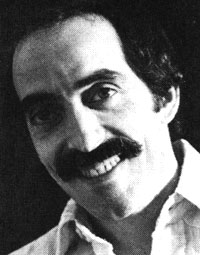
Tom Carnase
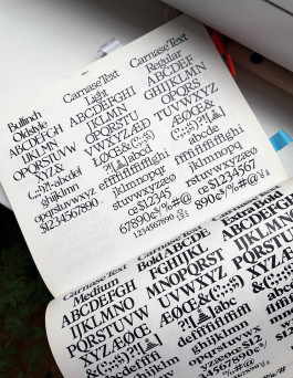
WTC Carnase Text
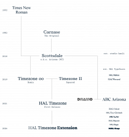
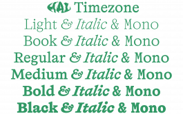
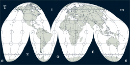
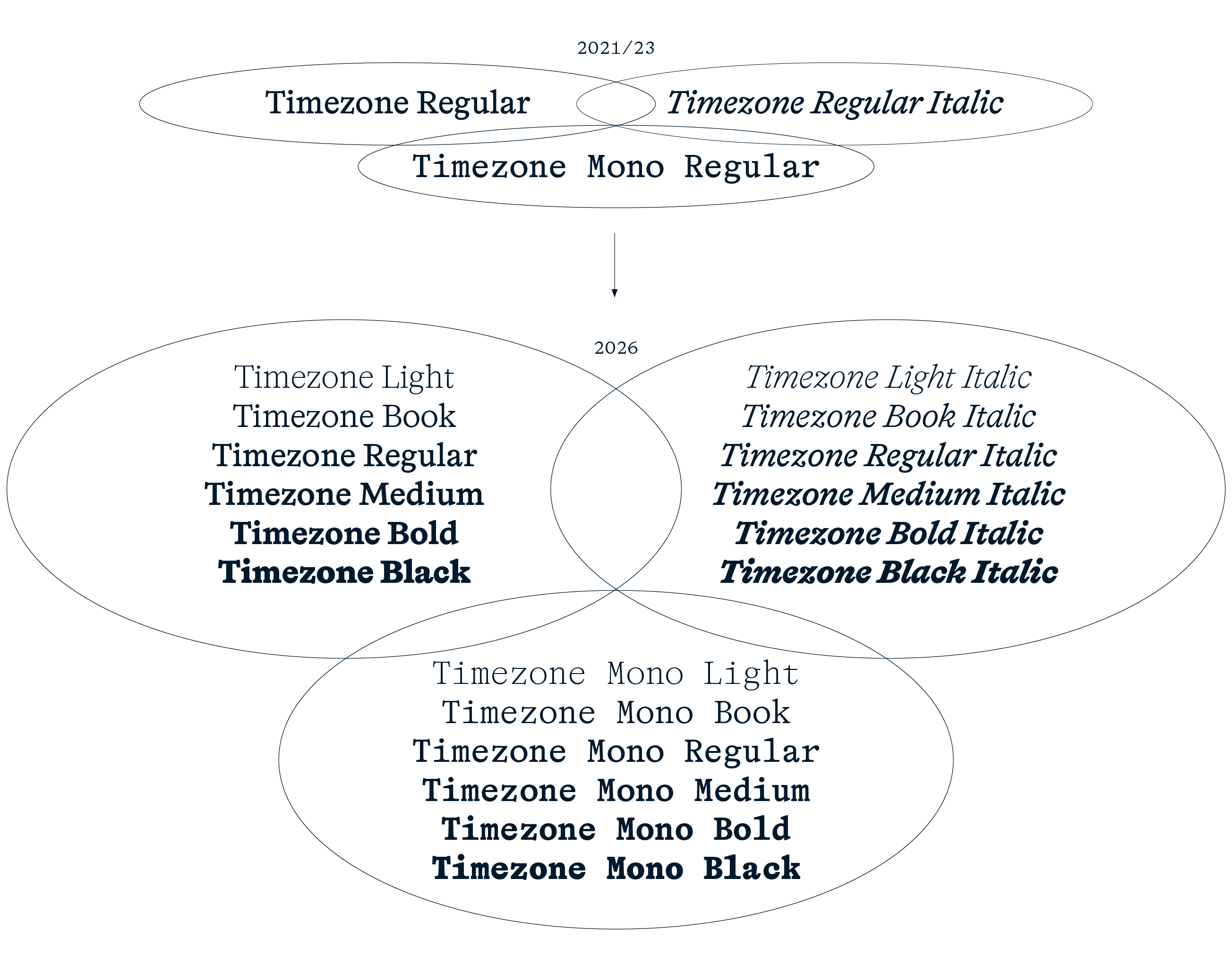
Typeface Genealogy: The Time(zone)line


Visuals from Unger’s essay “The Design of a Typeface” in Visible Language (1979)
“Rather than work against the requirements of the electronic process,
I designed Demos to work with it.” Gerard Unger

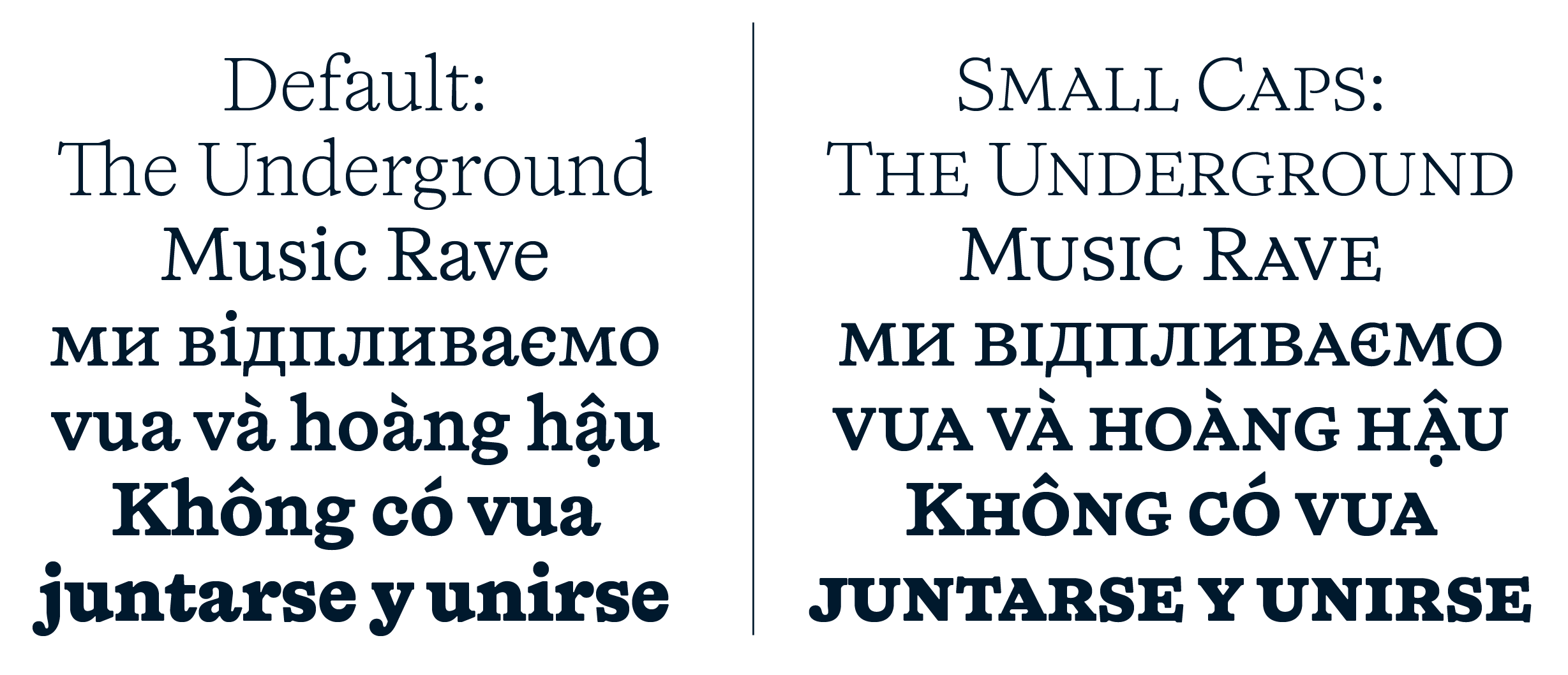
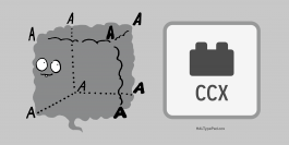
Contextual Alternates

Tom Carnase
WTC Carnase Text
Typeface Genealogy: The Time(zone)line
Visuals from Unger’s essay “The Design of a Typeface” in Visible Language (1979)
“Rather than work against the requirements
of the electronic process, I designed
Demos to work with it.” Gerard Unger
Contextual Alternates